Econa for Joomla
The only image custom field you will ever need! Upload, resize, crop and edit images for Joomla and K2. Integrates with Joomla Custom Fields providing responsive images, WebP images, retina images, automatic image resizing, multiple image sizes, custom image names, image editor and many other great features in a single extension!
Custom Fields
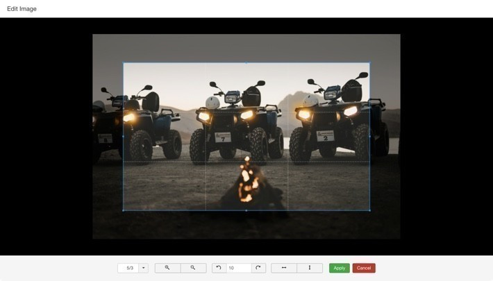
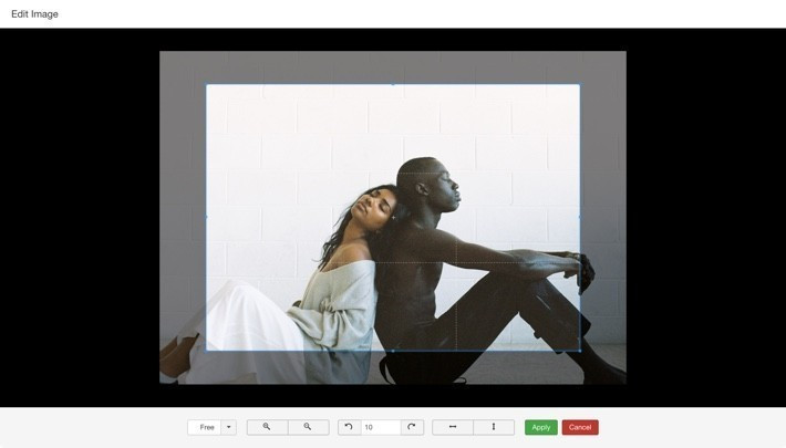
Image Editor
Responsive and Retina images for Joomla
Econa integrates responsive images in Joomla using the HTML5 srcset attribute. It allows you to define different image sizes for targeting different devices. Your site will serve automatically the most appropriate image size depending on the visitor's device saving user's bandwidth and thus making your site load faster. Here is a brief overview of how it works:
It's that simple to add responsive images to your site. Did we mention that Econa can also handle retina images? If you define additional images sizes with higher resolution the retina devices will get served those images automatically.
Image Editor
Both Joomla articles and K2 items now get a great image editor! Econa allows you to perform basic image editing operations like cropping, rotating and flipping directly in the Joomla article and K2 item edit forms.
Custom Image Names for K2 Items
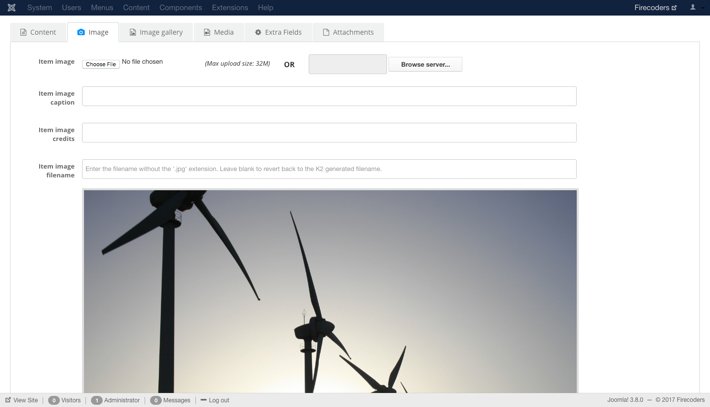
Improve K2 SEO by giving custom names to your K2 items images! You can enter the desired filename for the item image in the corresponding field that Econa adds in K2 "Image" tab in the item edit form.
Joomla Article Images
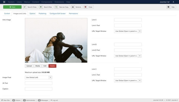
If for some reason you still want to use the core "Intro" and "Full" images that Joomla provides Econa gets you covered! Econa will add the image editor to those images so you can edit them! In addition to that, you can set the desired width and Econa will automatically resize those images when the article is saved.
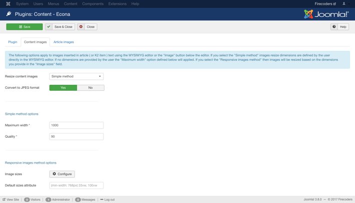
Resize Content Images
Econa can also optimize the images that users add to Joomla articles or K2 items text! There are two methods available for handling content images:
Simple method: Any image added using the WYSIWYG editor will be resized to the dimensions set by the user using the editor. Let's say for example that one user of the site uploads a really high-resolution image to insert in the article text. Then he resizes that image using the article's WYSIWYG editor to 600x600 pixels. Normally, Joomla will load the large image in front-end and then the browser will resize it to 600x600 pixels. This adds a lot of extra unnecessary load to the page. When using this method, the image will get resized automatically to 600x600 pixels saving your site's bandwidth!
Responsive images method: This method allows you to define up to ten sizes to get generated for images added in the content of Joomla articles and K2 items. Econa will generate automatically the HTML5 srcset attribute based on the generated images in order to make the images inserted in the WYSIWYG editor responsive!
